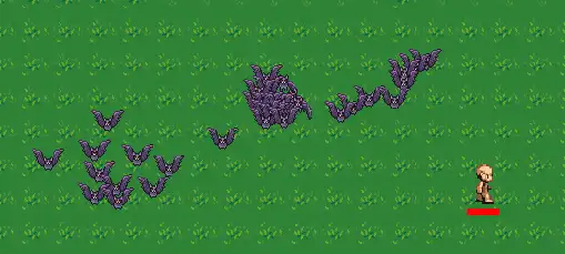
Continuing on from our Character Select Screen, lets do up a Level Select (or Stage Selection as Vampire Survivors calls it) for our player to both choose what map they'd like to play on, as well as view the level's info such as the time limit, bonuses and more. We'll also be introducing level buffs that can affect both players and enemies, adding variety to your level's mechanics and making each level more unique
Currently, our tutorial series only has one level, which is the Mad Forest, so with this new level select that we're gonna be implementing, it will enable us to create new levels much easier.
 Unlock Content

