Microsoft Word has a bevy of powerful chart-making tools, capable of creating almost any kind of graph or chart that one can imagine. The way to create some of these charts are not immediately obvious, however, and one of these kinds of charts is the histogram (with an accompanying frequency polygon).
Histograms with frequency polygons are often used in statistics to organise quantitative data and visualise frequency distributions. They are essentially bar-line graphs (the histogram is a bar graph, and the frequency polygon is a line graph), but without the gaps between the bars in the bar graph.
If you’re not fond of reading, you can also check out our video guide below. For those of you who prefer to read, scroll beyond the video to continue the article.
Creating the bar-line chart
To begin, we will first create a bar-line chart in our Word document. Once that is done, we will modify that so that it resembles a histogram used for visualising frequency distributions.
- We will start by creating a bar chart. Go to the Insert panel, then click on the Chart icon to open up a pop-up where you can select the chart you want to insert.
- Bar charts are categorised under the Column tab in this pop-up. Select the first chart in the Column tab, then click OK to create the chart.
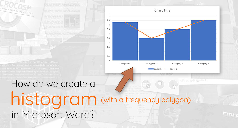
- A bar chart should appear on your Word document, alongside an accompanying Microsoft Excel window containing the data for the chart. Each horizontal category of your chart should be partitioned into 3 “series”. We will be removing Series 3, and formatting Series 2 so that it displays as a line (instead of a bar).
- Go to the Word document. Right-click on one of the Series 2 bars, and on the context menu that appears, select Change Series Chart Type. This should bring up a pop-up similar to the one seen when first creating the bar graph.
- On the ensuing pop-up, select one of the line graphs, then click OK.
- You should now have a bar graph from Series 1, and a line graph from Series 2, which come together to form a bar and line graph.
Article continues after the advertisement:
Turning the chart into a histogram
To make our bar-line chart into a histogram, we need to remove the gap between the bars.
- To do so, right-click on one of the Series 1 bars, and on the context menu that appears, select Format Data Point.
- This should bring up a sidebar (or a pop-up, depending on your version of Microsoft Word), wherein you can reduce the Gap Width. Although a histogram has technically no gap between its bars technically, settting the Gap Width to 0% is not visually appealing. Hence, you can assign a slight Gap Width, like say 3% for a better look. This should give you a histogram with a frequency polygon.
Adding and naming a secondary axis
Histograms used for displaying frequency distributions usually have 2 markers on the vertical axis. If you want to introduce a secondary axis on the right vertical of the graph, you’ll need to do the following.
- Right-click on the line chart (that represents the Series 2 data), and select Change Series Chart Type. This should open a pop-up for you to configure the type of graph that Series 2 should display as.
- There should be a list of the Series data on the pop-up, with a Secondary Axis checkbox beside each of them. Check the Series data that you want to serve as your secondary axis, and you should now see a secondary axis on the right vertical of the graph.
Conclusion
Did you manage to create your histogram with a frequency polygon? If we missed anything out, do let us know in the comments below.
thanks for your guide sir
This saved my life, thank you.
Glad to be of help Post.